by Oleg Kikin
This is the visualization system I created for the company I work for. We actually use it in production, and it has proven itself very useful when dealing with performance issues.
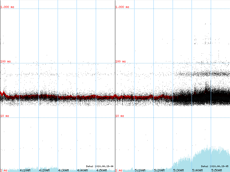
The system is based on a custom Apache LogFormat. We have %D ("The time taken to serve the request, in microseconds") parameter enabled, so the performance is measured by the server itself.
The visualization system grabs server logs for various apps hourly, builds charts from them, and saves them in PNG files. Then we have a simple page to browse the charts.
The code is written in PHP with GD library.
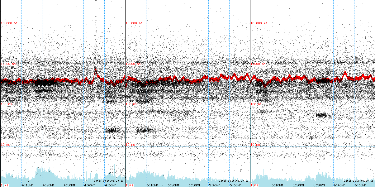
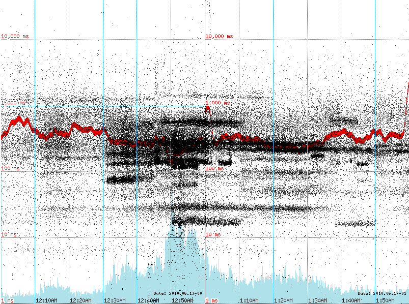
There are three things displayed on these graphs:
Here you can see two types of spikes. The one on the left hit something that was not cached well, and the app became slightly slower for a short period of time.
The spike on the right is closer to an SEM hit produced by our ad-ops team. It hit the pages that were cached, we got more cache hits than on average, and so the average request time (red line) went down for the duration of the spike.
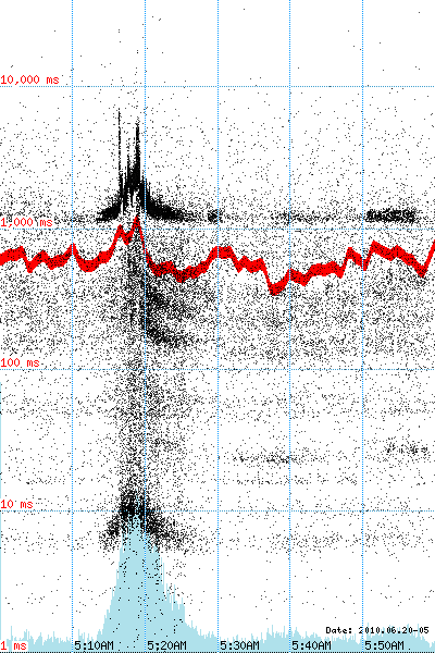
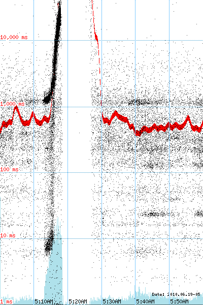
Here our app was hit with a traffic spike, quickly became slower and slower until the servers became unresponsive, and resulted in a 9 minute outage.
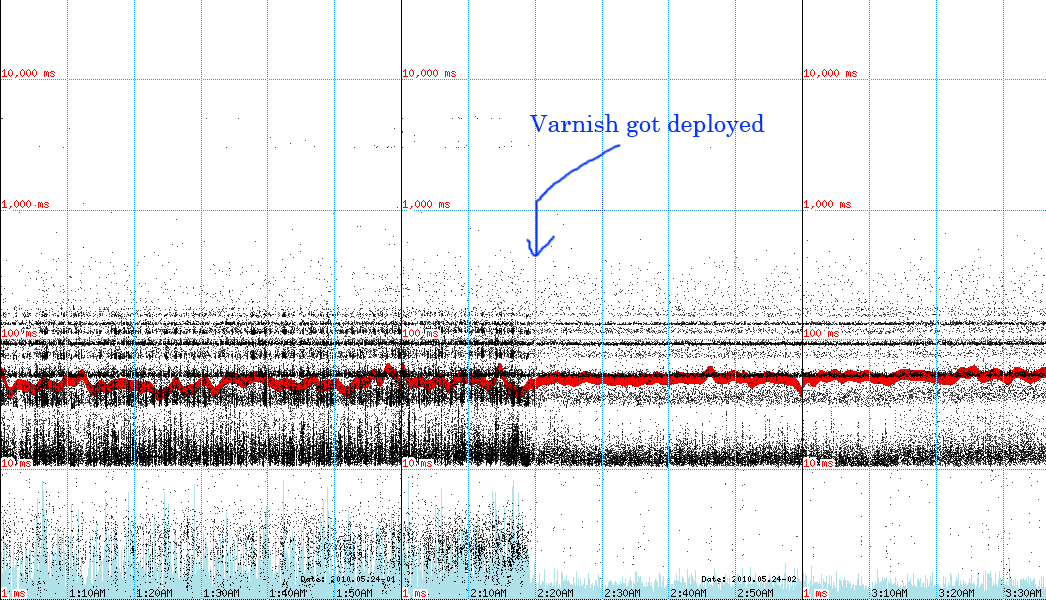
Here's a graph of our Drupal export app (it exports drupal nodes in the XML format). We deployed Varnish to alleviate the server load. As you can see, the number of requests dropped significantly.
This app is much faster, the average response time is around 50ms, and it handles traffic spikes pretty well.